Visualising the Social through Digital Art Practice
Flickr London
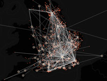
Our interactive map plots all of the geo-located photos in london uploaded to flickr from 2005.
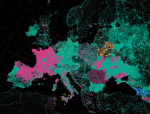
We’ve long been fans of Eric Fischers work, particularly his static maps of social network activity in cities, and how the coordinates aggregate into structures that mirror certain spatial aspects of the city whilst other territory is left in the shadows. In this piece of work we have used the same flickr data to create an interactive map, with each point linking back to the original image on flickr. These traces and mappings are never complete, always contingent, the photos plotted are just a small subset of photos from flickr that have GPS coordinates.
We’ve been curious to explore this data by adding a temporal dimension. To what extent do real world events manifest themselves in the data, and is it possible to retrace events unfolding over time?
If you load the map and run the default search from July to August 2011, you can clearly see the riots erupt in August. The timeline viewer enables you to toggle between a cumalative view, and a moving time frame. If you select a small time frame of about a week, and play this as a moving time frame, you can clearly make out the areas most effected by rioting in August – as the video below shows.
Photo Metrics
We are mapping various metrics, in this first release the attributes are date taken, number of views and density.
This version of the project is very much work in progress, we’re looking to developing interfaces for navigating the photos, users and tags.
The project uses the Flickr API and the excellent Open Layers. To display the large number of articles we wrote a subclass of the Open Layers Canvas renderer, and optimised for point plotting. As a fallback for browsers that don’t support canvas we included the FlashCanvas shim. http://flashcanvas.net/. We’re still using a Google basemap for now but will be changing that soon.


